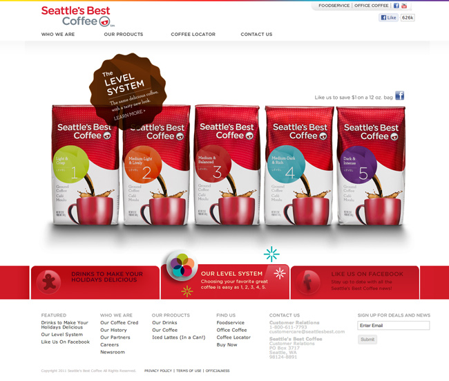
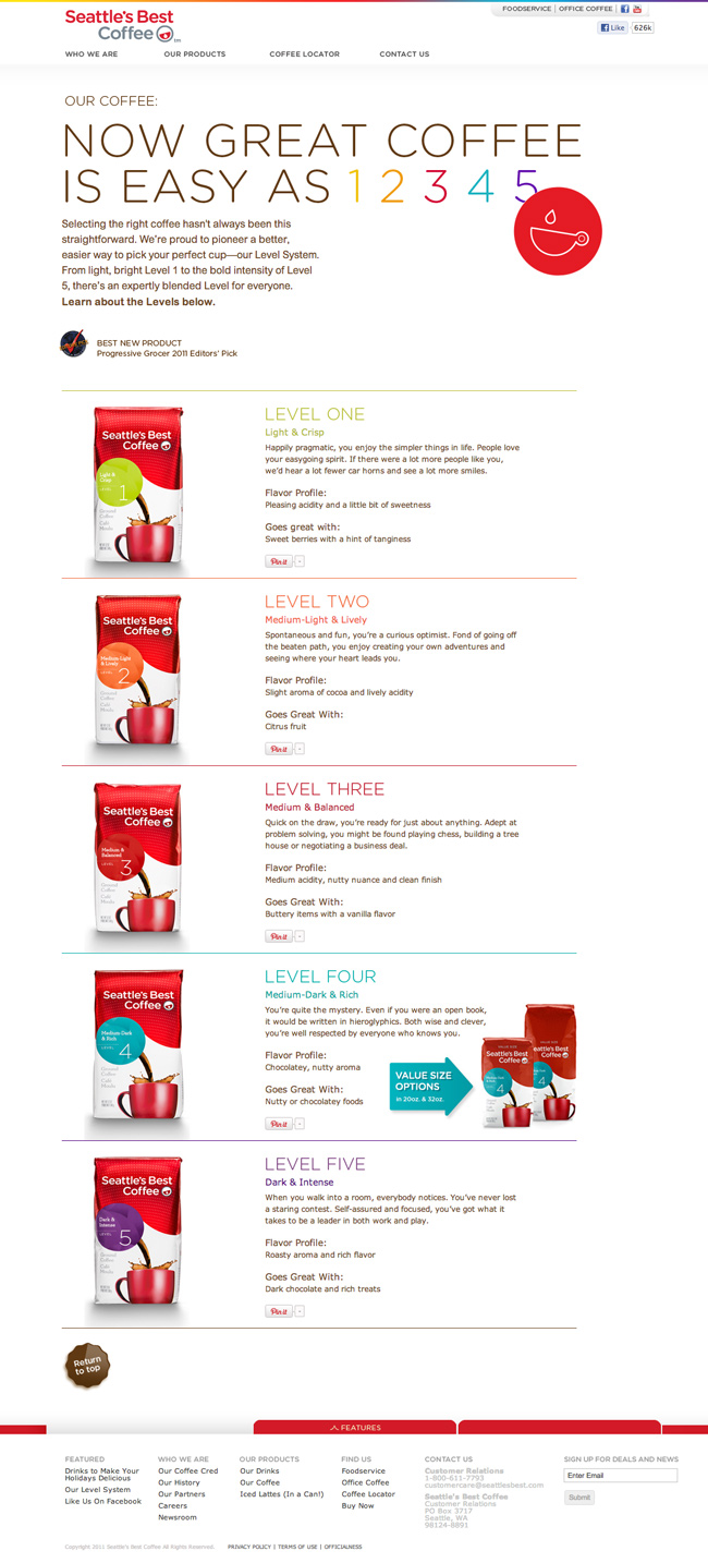
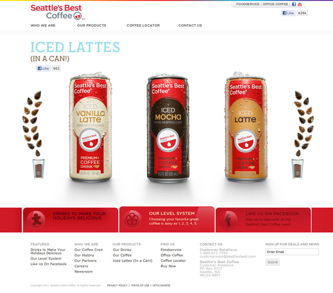
This week’s favorite site goes to Seattle’s Best Coffee for its simple, clean and well branded experience. I really like the use of white space, quality product imagery and consistant branding throughout. Very simple yet packs some nice visual details throughout.
5 CommentsLeave a Comment |


Yes nice pages! Although the drop shadows on the second image (showing the products in a line) is a little too strong for my taste. But the “level 1-5” shadow is a more like it… but here the shadow looks cropped on the left and right… could be just my monitor?
Wow, this is a very clean site. I love the design how it flows.
I agree Dougieladd. The first ones are to strong for the overall site and make it look too dark. The second ones in question are way wrong lol. But the site is nice and boy do I love their coffee. Nice pick Mike.
I don’t like drop-down menus as a user but I really like the way all the menus are readable as you hover over one. Nice touch. I can see what’s on the other menus without a bunch of tabs opening and closing.
I see that you guys are saying about the darkened drop shadow on the 2nd page. Maybe because I’m viewing it in a mobile devices I don’t but I think it looks fine. I think since the coffee is grouped together its sappose to have a darker shadow to it. Just a thought. Clean layout though. Nice and simply but yet bold because of the string clear images.