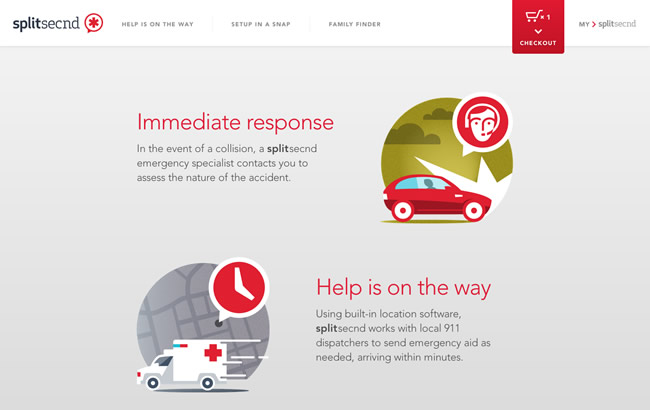
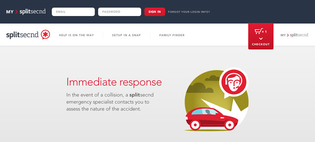
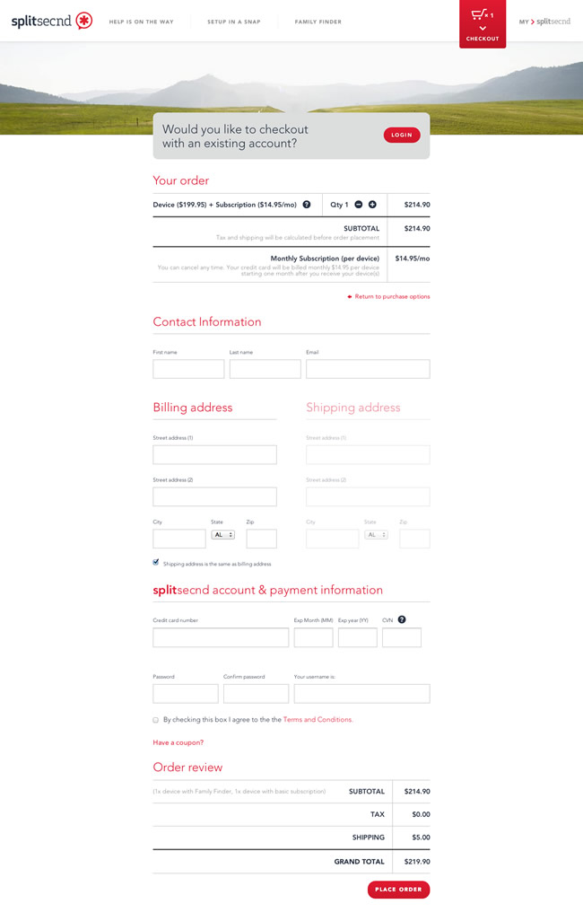
This week’s favorite website goes to splitsecnd for its clean, fresh design and lightweight UI. Splitsecnd has a beautiful site that does an excellent job promoting its product. Professional close-ups, nice complimentary illustrations, gorgeous product display, white space, clean UI and overall simplicity makes this site a favorite. Simplicity and Quality are two words that comes to mind when I use this site. Great piece for the inspirational archive.
Click on an image to enlarge:


Yes, a great site Mike.
I love this simplicity, the big images and ui elements.
To my mind there could be a little more CSS3 animations, maybe a little hover transition over the naviagation bar. Just a color change makes it a bit boring to me :)
And the cool thing, it’s made responsive too.
@Oliver – Yea, simplicity is hard to pull off. There’s a fine line between being simple and lacking enough content for the user. Didn’t even know it was responsive as well. Another plus. ;) … thanks for the feedback.
I agree. Simple but maybe to simple. The icons that I thought something woud happen nothing did. Gotta think about the UX a little more. What is the use going to automatically want to do?
@Kris – Good insight. Normally when you look at a site from a user’s perspective, you have to assume that the user is interested in the product. For example, think of a user in the market for a crash detection devise (of some sort). Generally, the user interactions will include learning everything they need to know about the product, features, how it works, what it looks like, pricing, where and how to purchase, etc. When you look at this site, its actually a micro site that is positioned perfectly for these use cases. Also, the job of a microsite is to get the user to buy (i.e. the big purchase button in the top right).
If a user hovered over an icon and it did nothing, in most cases, this wouldn’t be considered a bad user experience because its not a “web standard”…meaning, an interaction that does a particular action in 99% of the cases. For example, clicking on a navigation link and being taken to another page is a “web standard”. Now if you clicked on a link and nothing happened, that would be considered a bad experience. But hovering over an icon could be a toss up either way.
Good discussion!
Really nice, can’t get lost in this one for sure xD