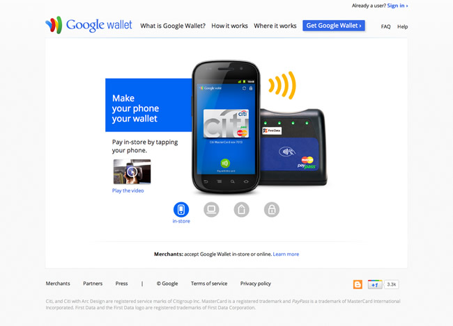
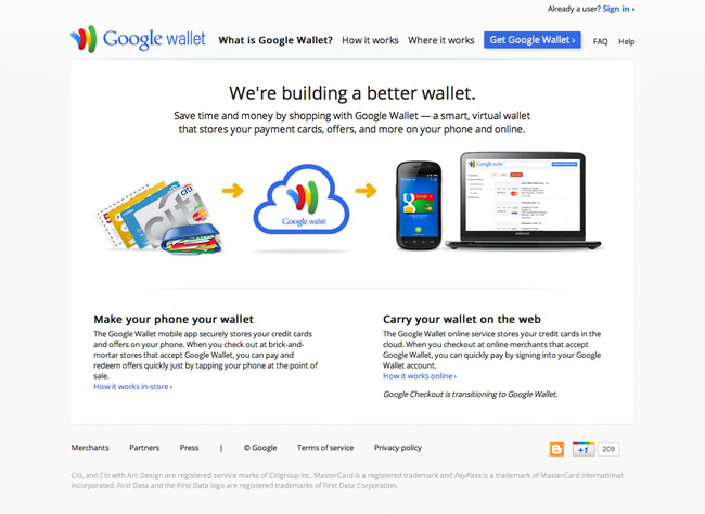
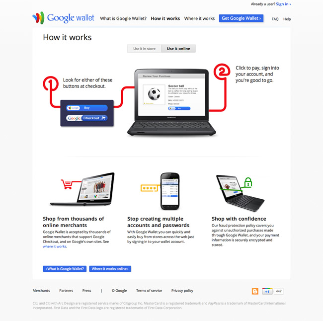
This week’s favorite website goes to Google Wallet – a fresh, simple and clean microsite / landing page. I think the designers did a great job maintaining the simplicity of Google’s brand, while making it look fresh and modern. Really nice example of an effective consumer facing landing page.
6 CommentsLeave a Comment |


Great example. I like the way they seem to only use the colors fromr the logo and branding. Thanks
Loved this example! Wonderful design. Simplicity and very good usage of color.
@Kris, @Vishnu – Glad you like this one. Great use of colors indeed. Nice use of white space.
Hi Mike. I think the navigation could be a little confusing. What’s your take on that? The icons down there are great but without the hover effect would anybody EASILY know what they’re about? I think the bottom line is ease of communication in design. And another observation is that there seems to be no definition between the site and the all white background. Was thinking there could be a mild grey shadow effect to define the site. What effects do all these have? Keep the great work up.
Emmy, great observations. You make some good points. I think acting on those two areas (background gradient and labels over the icons) would definitely enhance the site a bit and provide a better experience. I think the navigation is fine. Its so clean and clutter free that there isn’t a problem navigating the site. Each time you look at a site, there is always a grey area of subjectivity. This means that there will always be areas of any site that can be improved on depending on who you ask. Design is subjective from person to person. You could very well make those changes you suggest and someone might say those areas weren’t needed. That’s always the case in design. I think the gradient on the background would be a nice treatment. But I understand why they didn’t add it. It’s really not apart of Google’s brand in my opinion. They don’t use much gradient treatments throughout any of their sites so I suspect that the use of a completely white background (no gradients) could be apart of their brand guidelines. But in most cases, I think a background gradient would really add nice depth to this site. Great points you make. ;)
Thanks man, great talk. Design is subjective. I have a slogan which says ‘creativity is not subjectivity’. How do we harmonise these two school of thoughts? Sorry if am kinna bugging you with so much.